
UGUI / Unity
Unity UGUI Principles (5): Auto Layout
Goal
- Understand the Auto Layout system architecture.
- Understand how Layout Element defines element size.
- Understand how Horizontal, Vertical, and Grid Layout Groups arrange elements.
- Understand how Content Size Fitter and Aspect Ratio Fitter control size.
Other articles in this series
- Unity UGUI Principles (1): Canvas Rendering Mode
- Unity UGUI Principles (2): Canvas Scaler and UI Scaling
- Unity UGUI Principles (3): RectTransform
- Unity UGUI Principles (4): EventSystem, Events, and Input
- Unity UGUI Principles (5): Auto Layout
Environment
- Windows 7
- Unity 5.2.4
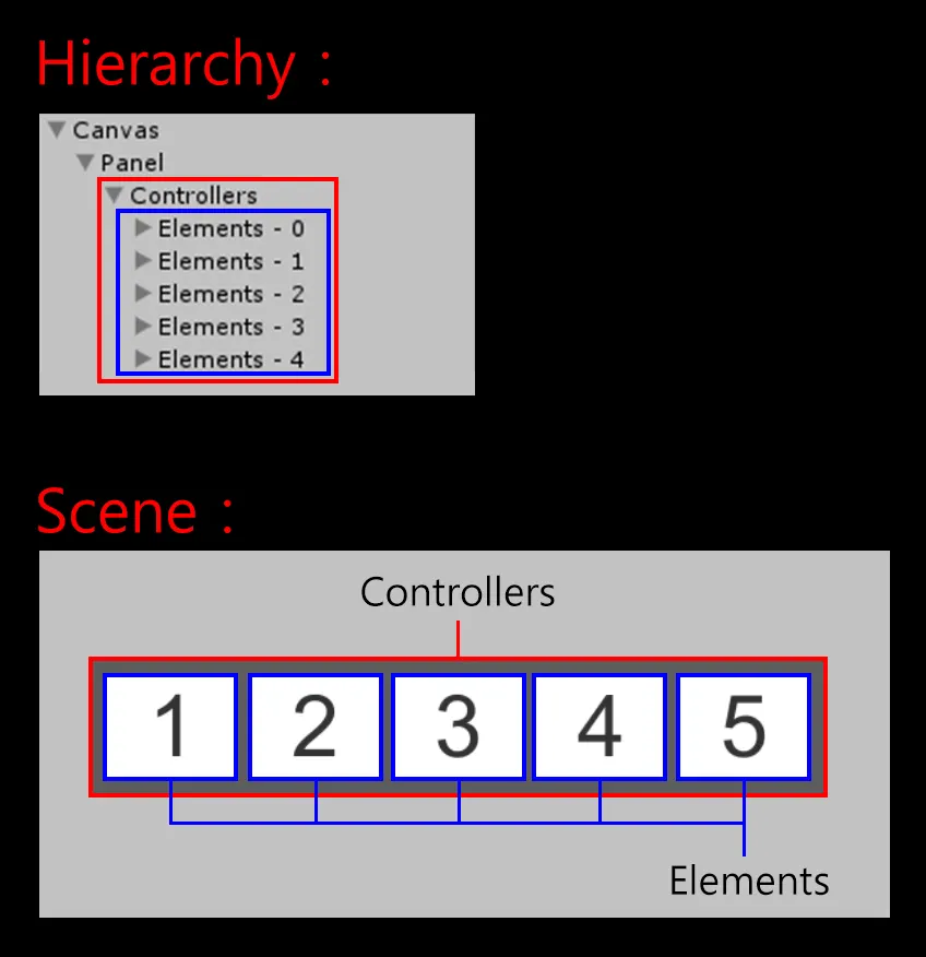
Auto Layout System
The Auto Layout system is built on RectTransform. It automatically adjusts size, position, and spacing for one or more UI elements.
The system has two main parts:
- Layout Controllers: usually parent objects that arrange children.
- Layout Elements: usually child objects that describe their sizing rules.
The basic architecture looks like this. This article focuses on the concept first; implementation details come later.
Layout Element (child object)
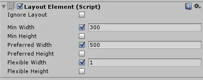
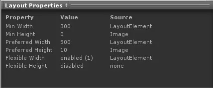
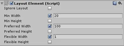
Layout Element describes the size requirements of an element:
- Minimum Width
- Minimum Height
- Preferred Width
- Preferred Height
- Flexible Width
- Flexible Height
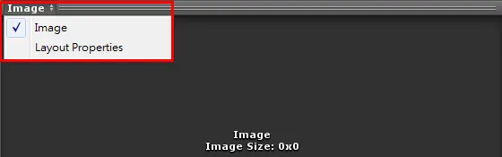
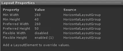
After selecting a UI element, switch to Layout Properties at the bottom of the Inspector to inspect these values.
Layout Controllers read Layout Element sizes and allocate children with these rules:
- Allocate Minimum Size first.
- If there is enough space, allocate Preferred Size.
- If extra space remains, allocate Flexible Size.
The following images show how width is allocated.
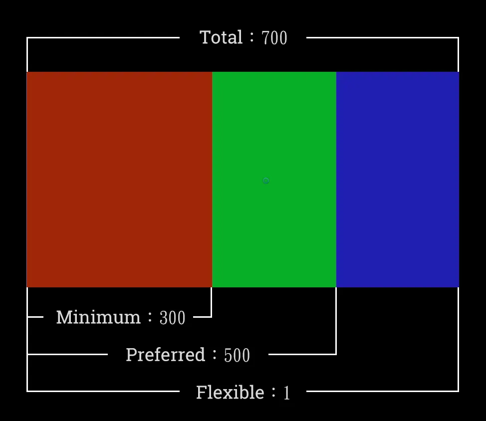
- Allocate Minimum Size first: 300, shown in red.
- If enough space remains, allocate Preferred Size: 300-500, shown in green.
- If extra space remains, allocate Flexible Size: 1, shown as 500-700 in blue.
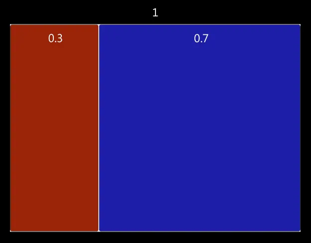
Flexible sizing is proportional. If multiple children have Flexible values, extra space is distributed according to those values. In the example below, 0.3 and 0.7 produce a 3:7 ratio.
One more detail: Text and Image components automatically calculate Preferred Size from their content.
Layout Controllers (parent object)
Layout Group
Layout Group does not control the size of the parent object itself. It controls the size and position of child objects. In most cases, it allocates space from each child’s minimum, preferred, and flexible sizes.
Layout Groups can be nested and come in three common types: Horizontal, Vertical, and Grid.
Horizontal Layout Group
Horizontal Layout Group arranges child objects along the horizontal axis.
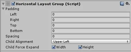
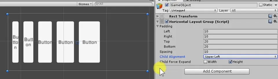
Component path: Component -> Layout -> Horizontal Layout Group.
- Padding: internal spacing.
- Spacing: space between elements.
- Child Alignment: alignment when children do not fill all available space.
- Child Force Expand: forces children to fill available space.
Example setup:
- Open a new scene:
File -> New Scene. - Add a Canvas:
GameObject -> UI -> Canvas. - Add an empty object under the Canvas as the Layout Controller.
- Add Horizontal Layout Group to that parent object.
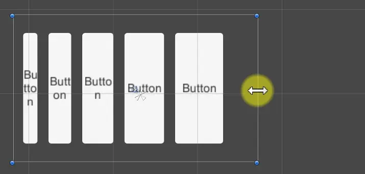
- Create five Button children under the parent. Their sizes update automatically when the parent changes.
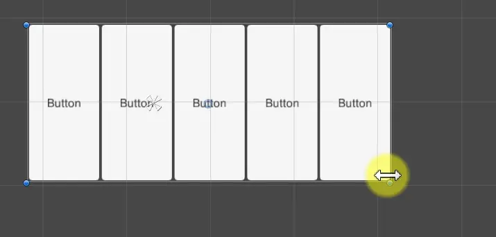
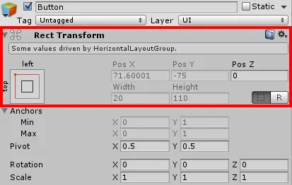
At this point, the Button RectTransforms cannot be edited directly because the Horizontal Layout Group controls them. Unity shows which Layout Group is controlling the RectTransform.
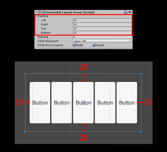
Adjust Padding to see the internal spacing.
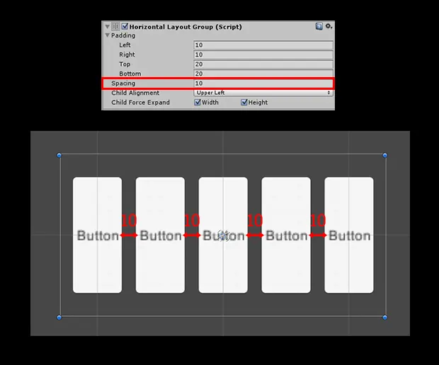
Adjust Spacing to see the gap between elements.
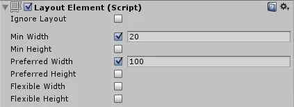
Next, add Layout Element to the five Buttons so their default sizes can be overridden manually.
Component path: Component -> Layout -> Layout Element.
Uncheck Child Force Expand Width on the Horizontal Layout Group so children do not automatically fill all extra space. Their size now comes from Layout Element.
Review the allocation rules:
- Allocate Minimum Size first.
- If enough space remains, allocate Preferred Size.
- If extra space remains, allocate Flexible Size.
Set the Min Width values of the five Buttons to 20, 30, 40, 50, and 60. You can see each Button’s width distribution. Changing the parent size does not change the children yet, because only Minimum Width has been allocated.
Change Child Alignment to see how the elements align inside the parent.
Parent Layout Properties:
Min Width = button widths (20 + 30 + 40 + 50 + 60 = 200) + Spacing (40) + left/right Padding (20) = 260
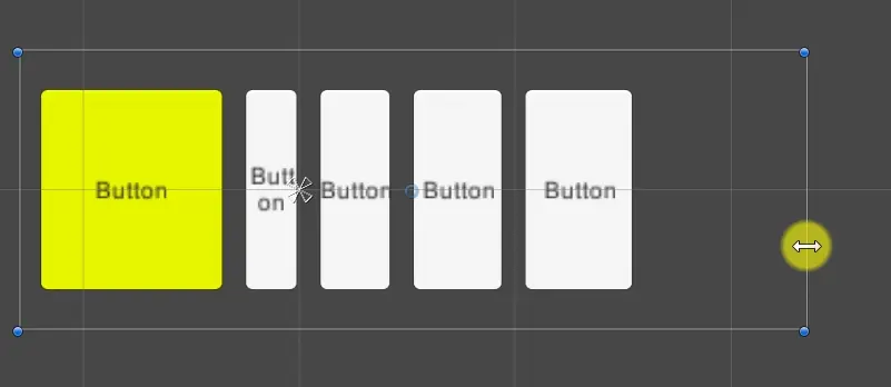
Now adjust the first Button’s Layout Element as shown below and set Preferred Width to 100.
- Allocate Minimum Size first:
20. - If enough space remains, allocate Preferred Size from
20to100.
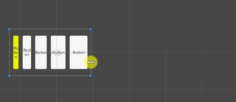
Next, set Flexible Width to 1.
- Allocate Minimum Size first:
20. - If enough space remains, allocate Preferred Size from
20to100. - If extra space remains, allocate the remaining Flexible Size.
Now enable Child Force Expand Width on the Horizontal Layout Group to force child objects to fill the available space.
- Allocate Minimum Size first:
20. - If enough space remains, allocate Preferred Size from
20to100. - If extra space remains, allocate Flexible Size and Child Force Expand Width.
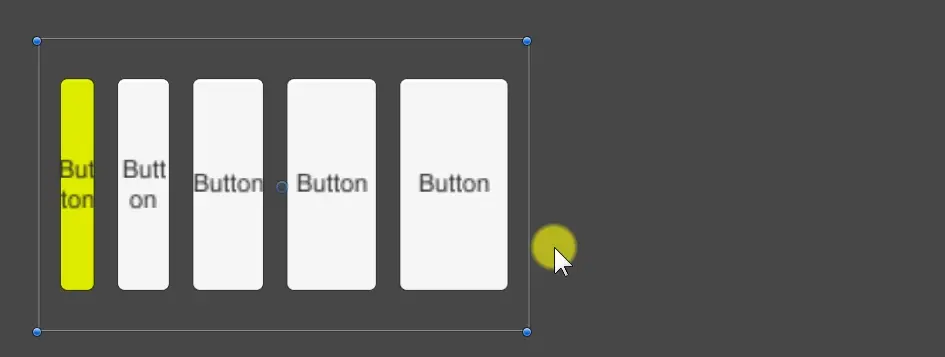
Conclusion: Horizontal Layout Group allocates Minimum Size first, then Preferred Size, then Flexible Size and Child Force Expand. That is the core rule behind how it reads Layout Element values and assigns child sizes.
Vertical Layout Group
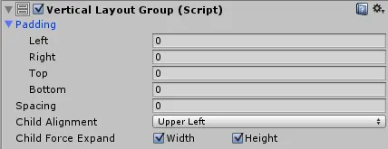
Vertical Layout Group arranges child objects along the vertical axis. It works the same way as Horizontal Layout Group, but uses height instead of width.
Component path: Component -> Layout -> Vertical Layout Group.
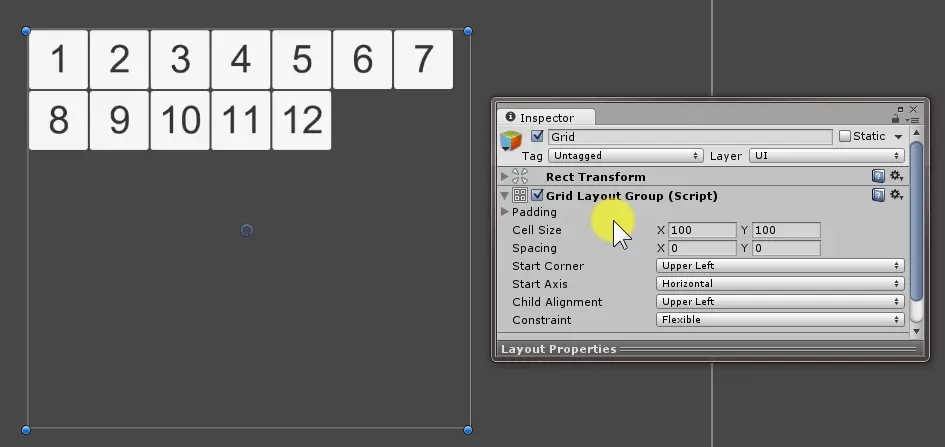
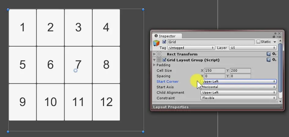
Grid Layout Group
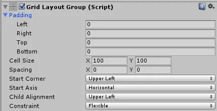
Grid Layout Group arranges child objects in a grid.
Component path: Component -> Layout -> Grid Layout Group.
- Padding: internal spacing.
- Cell Size: width and height of each element.
- Spacing: space between elements.
- Start Corner: the corner where layout starts: upper left, upper right, lower left, or lower right.
- Start Axis: horizontal or vertical arrangement.
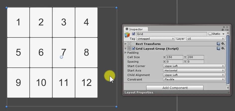
- Child Alignment: alignment when children do not fill all available space.
- Constraint: layout restriction.
- Flexible: automatically arrange according to available size.
- Fixed Column Count: limit the number of columns.
- Fixed Row Count: limit the number of rows.
Layout Fitter
Layout Fitters control the size of the Layout Controller itself. The size can come from child objects or a configured aspect ratio. The two common fitters are Content Size Fitter and Aspect Ratio Fitter.
Content Size Fitter
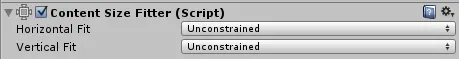
Content Size Fitter controls the size of the parent object based on the Minimum or Preferred size of its child objects. The resize direction can be changed through Pivot.
Component path: Component -> Layout -> Content Size Fitter.
- Horizontal Fit / Vertical Fit: controls horizontal and vertical fitting.
- None: no adjustment.
- Min Size: fit to the child’s Minimum size.
- Preferred Size: fit to the child’s Preferred size.
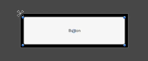
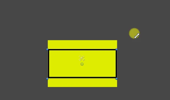
Example requirement: make the parent size follow the child size. The result looks like this. A black outline is added so the parent size is easier to see.
Setup:
- Open a new Scene:
File -> New Scene. - Add a Canvas:
GameObject -> UI -> Canvas. - Add an empty object under the Canvas as the parent Layout Controller.
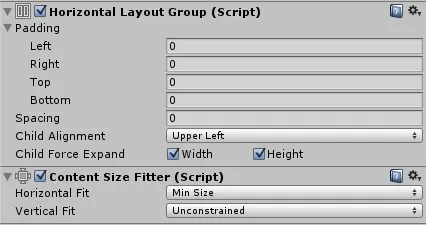
- Add Horizontal Layout Group to the parent.
- Add a Button child.
At this stage, Horizontal Layout Group controls the child size through Layout Element values, but it does not resize the parent itself.
Add Layout Element to the Button, override the default size, and set Minimum Width to 100.
Component path: Component -> Layout -> Layout Element.
Add Content Size Fitter to the parent. Set Horizontal Fit to Min Size, so the parent width comes from the child’s Minimum Width.
If you duplicate the Button, the parent size now changes with the children.

Adjust the parent’s Pivot to control the resize direction.

The full pattern is: use Horizontal Layout Group to arrange child objects, use Layout Element to define child size, then use Content Size Fitter to make the parent read those child sizes and resize itself.
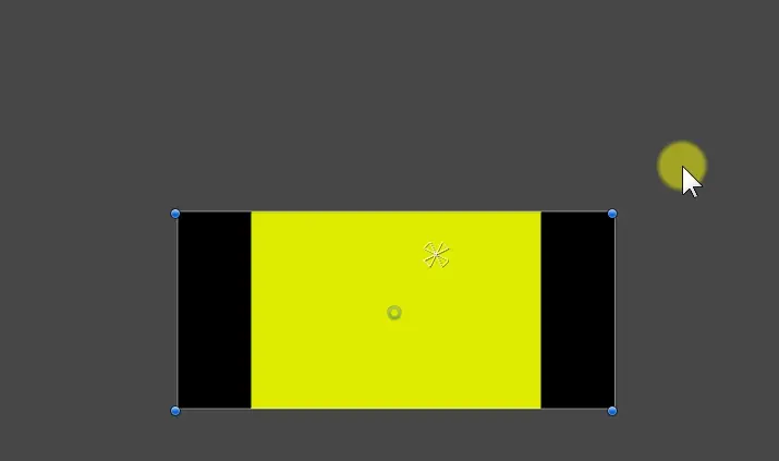
Aspect Ratio Fitter
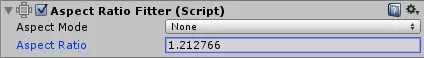
Aspect Ratio Fitter controls the size of the parent object based on an aspect ratio. Pivot controls the resize direction.
Component path: Component -> Layout -> Aspect Ratio Fitter.
Aspect Mode options:
- None: no adjustment.
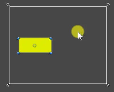
- Width Controls Height: width drives height according to the ratio.
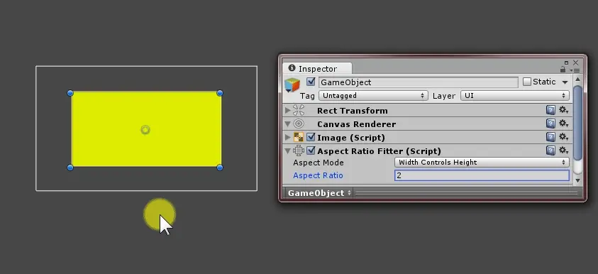
When width changes, height changes proportionally.
Height Controls Width uses height as the base and changes width according to the ratio.
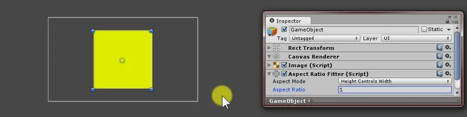
When height changes, width changes proportionally.
Fit In Parent automatically adjusts width, height, position, and anchors so the graphic fits entirely inside the parent. It may leave empty space.
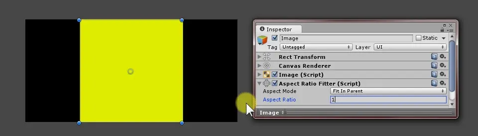
When the parent size changes, the object fits inside it according to the ratio.
Envelope Parent adjusts width, height, position, and anchors so the graphic fully covers the parent. It may exceed the parent’s bounds.
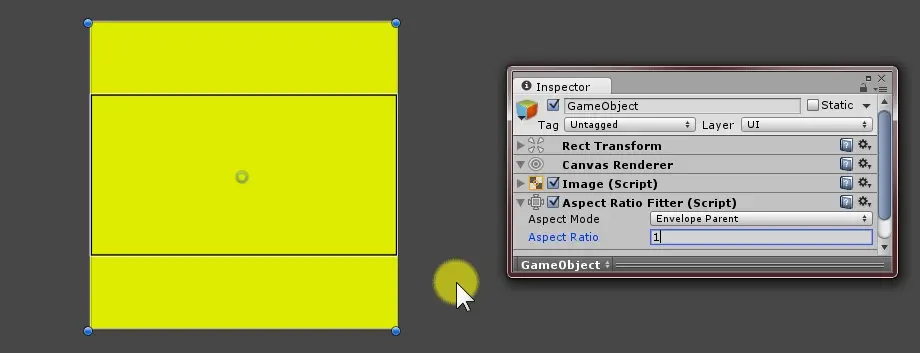
When the parent size changes, the object continues to cover it according to the ratio.
Aspect Ratio is width / height.
Difference
Content Size Fitter sizes an object from its children. Aspect Ratio Fitter sizes an object from a numeric ratio.
Postscript
Auto Layout is one of the UI features worth learning properly. It arranges multiple UI elements quickly, reacts to size changes, and works well with nested layouts. It also makes later UI changes less painful, which is not glamorous but matters in production.
References
Attribution
Please credit ARKAI Studio and link back to this article when quoting or reposting.